 commonsymbols.com
Figma Library
Use Figma's native library system to keep visual components synchronized across teams with automatic updates and smart overrides.
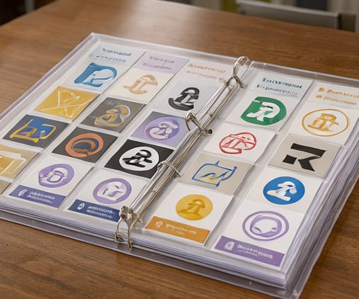
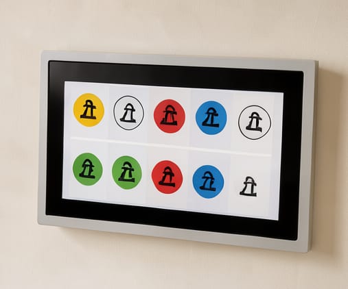
The Commonsymbols Figma library is structured around smart components that support meaningful state variations—like hover, active, and disabled states—without duplic assets. Designers can import the library once and receive community-driven updates automatically, ensuring consistency as symbol meanings evolve. Each component is built with instance overrides enabled, allowing developers to override text, icons, and colors while preserving design integrity.
Integration begins by opening Figma, navigating to the File > Library menu, and selecting the Commonsymbols library. Once added, you can drag symbols directly into frames or pages, and updates pushed to the upstream repository propagate through your files. This is especially helpful for teams managing multiple projects or growing design systems, as changes to a single component reflect everywhere it’s used.
When customizing symbols, always use instance overrides instead of editing the source component directly. This preserves sync capability and avoids accidental divergence. The library also includes hidden variants for internal use, which can be exposed selectively via the component settings panel. Designers report time savings when aligning visuals across documentation, dashboards, and marketing materials using this method.