 commonsymbols.com
Print Terminology
Typeface-agnostic glyphs for typography guides, style manuals, and printed reference materials.
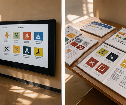
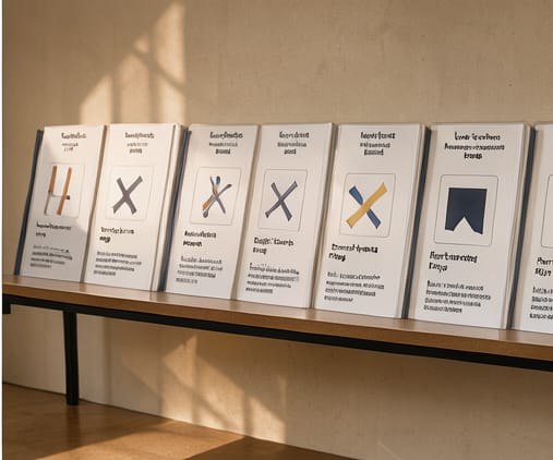
Print Terminology provides minimal, line-based glyphs for referencing type terms like kerning, ligatures, and baseline alignment. These are designed to remain legible across a wide range of printing conditions—offset, inkjet, and letterpress—and at small point sizes common in reference materials or technical documentation.
The set avoids style-specific traits, so users can match glyphs to any text typeface without visual mismatch. stroke widths and corner radii are derived from standard typographic proportions, ensuring the symbols feel like part of the same typographic family as surrounding text. This supports seamless integration in style guides or academic handouts.
We include glyphs for less common but frequently cited terms like x-height, ascender, descender, and cap height. Each entry is optimized for black-and-white printing, eliminating color-coding entirely. This simplifies reproduction and avoids issues in mono or low-end printing environments.